Tag Archives: container painting

A year of painting and blogging!

Today I have been writing this blog for one year.  🙂  I started this to blog my paintings, suspecting that getting a little feedback on them would motivate me to keep me painting.  It worked!!  Moreover, I took Jim’s advice and decided to stick to a schedule of posting twice a week.  Though I did shift my original Tuesday/Friday schedule to Wednesday/Saturday, I still cannot believe I have actually posted twice a week — every week — for a full year.  Of course some posts have been… lackluster, but then I’ve also been surprised by which have been more popular.

So on this, the conclusion of year one, I want to sincerely thank all of you.  Thank you.  Thank you for visiting!  It’s not flattery — it’s straight truth when I tell you that it’s your comments and likes that keep the posts and paintings coming.  🙂

I want to especially thank Jenna, Marina, Dani, Joseph, and QueridaJ for all the artistic support and encouragement!  Thank you so much!  🙂

Here is a slideshow of the OMIGOD 61 paintings (mostly) I’ve completed this past year:

This slideshow requires JavaScript.

23 Comments

Filed under Paintings

Painting: Container 3

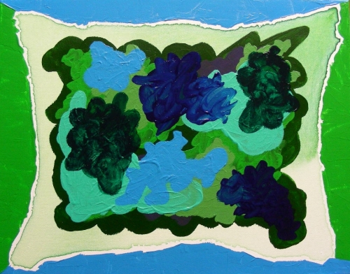
I did a third container, green and blue.

Container 3, acrylic on 11" x 14" canvas, February 2012

vertical spacer invisible gif

Recapping the rules from patternsthatconnect:

  1. With diluted paint lay a light ground and leave to dry
  2. Pour paint of similar colour onto the ground and spread it by pushing with a brush from the centre towards the edges of the canvas. Allow a shape to form, rather than delineating an outline. Then leave to dry.
  3. Pour other similar colours (in pairs of the same colour) onto the new shape or secondary ground, again allowing them to form their own shapes, but not allowing them to spread beyond the boundaries of the secondary ground.
  4. Around the edge add a ‘frame’ of four different colours, one for each edge, one colour being the same as one in the painting and the others contrasting with the colours laid down so far. Allow the frame to meet the colours of the image but not to cover them.

vertical spacer invisible gif

I used just two colors for the ‘frame’, and used a green and blue palate, but other than that it’s pretty much the same process as I used for the first and second containers.  Enjoy!  🙂

“That’s all I have to say about that.”  – Forrest Gump

11 Comments

Filed under Paintings

Painting: Container 2

I did another Container painting:

Container 2, acrylic on 11" x 14" canvas, February 2012

Vertical spacer invisible gif
Again, the rules for this from patternsthatconnect:

The Rules:

  1. With diluted paint lay a light ground and leave to dry
  2. Pour paint of similar colour onto the ground and spread it by pushing with a brush from the centre towards the edges of the canvas. Allow a shape to form, rather than delineating an outline. Then leave to dry.
  3. Pour other similar colours (in pairs of the same colour) onto the new shape or secondary ground, again allowing them to form their own shapes, but not allowing them to spread beyond the boundaries of the secondary ground.
  4. Around the edge add a ‘frame’ of four different colours, one for each edge, one colour being the same as one in the painting and the others contrasting with the colours laid down so far. Allow the frame to meet the colours of the image but not to cover them.

Vertical spacer invisible gif

This time I fractured the rules even further by using two colors for the wash that was the first ground, and continuing with two colors in pairs for the main part of the  painting (step 3).  When the reds and yellows started mixing on the canvas into icky baby-poop browns instead of the stunning, sunset-like oranges I wanted, I quickly I decided ‘two colors’ had been a mistake.  But I let it dry and continued later without mixing on the canvas, and it worked out ok in the end.  Finally I left the rails completely and finished it off with some red and yellow mark making.

While working on this I finally found a shade of red that I like!  🙂  Pyrrole Red!  Woo!  Maybe I should do a painting using only my favorite colors — Pyrrole Red, Alizarin Crimson, Cadmium Yellow Light, Brilliant Blue, Light Aqua Green, Bright Green, and Phthalocyanine Green.  Maybe some black too.  That would have to look awesome!

I’ll finish this post with an invitation to a painting challenge!  I would love to see what you would create from these guidelines.  Yes you.  To call out just a few of you specifically:

If you feel like painting this way, I would love to see your interpretations!

  • Jenna of The Cozy Red — this strikes me as a great way to get started with abstraction, which I think you mentioned you’d like to do!  C’mon, it’s one painting.  It need not derail your oil painting class.  🙂
  • Rob — this strikes me as a great way to get started with painting, which I think you mentioned you’d like to do!  C’mon, it’s one painting.  It need not derail your photographic endeavors.  🙂  This is a good way to start.

Lets paint!!  🙂

6 Comments

Filed under Paintings